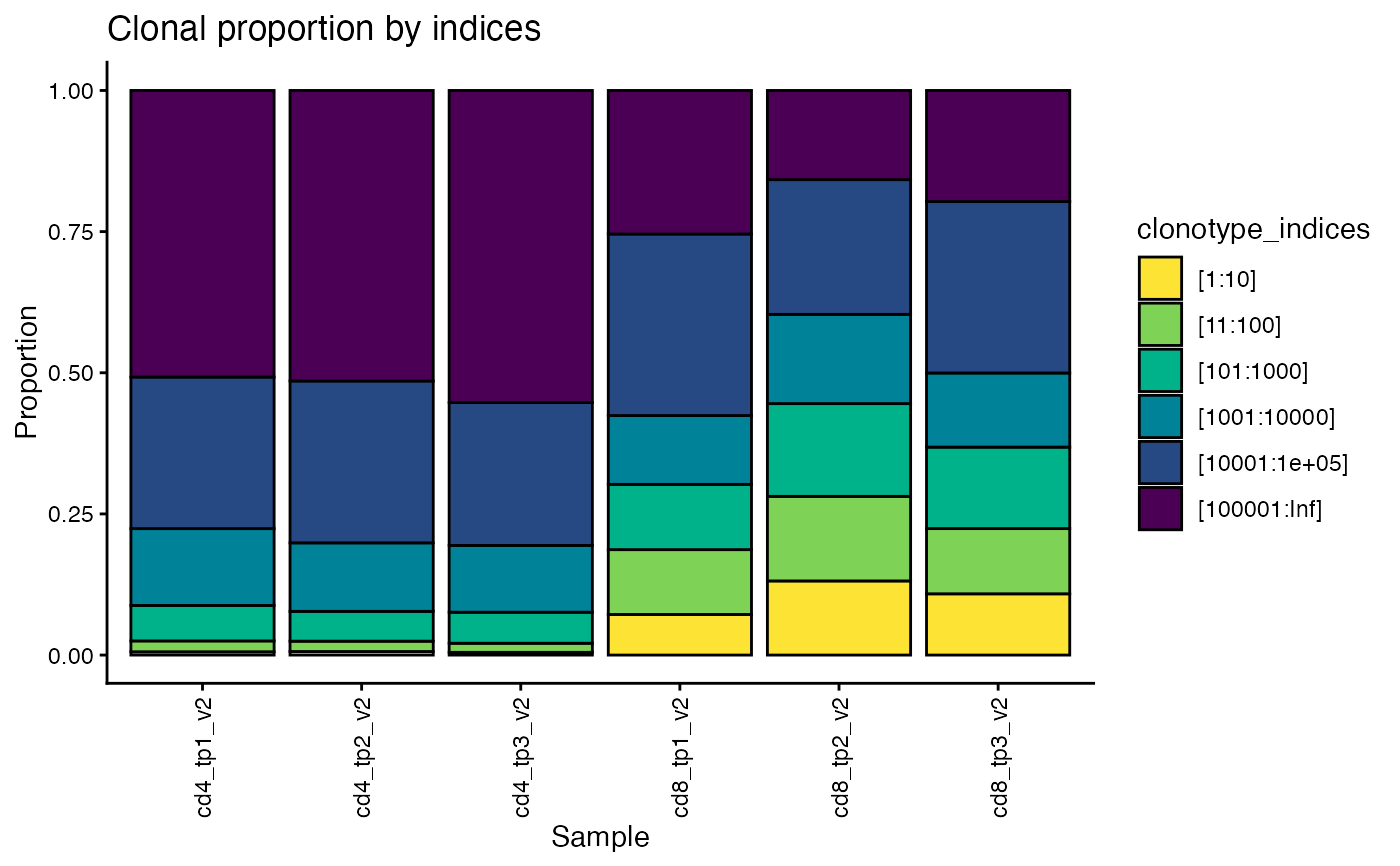
Stacked bar chart with fractions of reads attributed to the most frequent clonotypes
plot_clonotype_indices.Rd![[Experimental]](figures/lifecycle-experimental.svg)
plot_clonotype_indices() creates a stacked bar chart containing the fraction of
reads for the top 10 most frequent clonotypes, the 11th to 100th most frequent
clonotypes, the 101st to 1000th most frequent, and so on, for each sample in the dataset.
Usage
plot_clonotype_indices(
  data,
  chain = c("beta", "alpha"),
  cutoffs = 10^(1:5),
  group_col = NULL,
  label_col = "Sample",
  flip = FALSE,
  return_data = FALSE,
  color_scheme = NULL
)
Arguments
- data
a TIRTLseqDataSet object
- chain
the TCR chain to use (default is "beta")
- cutoffs
the indices used for the end of each group in the bar chart. The default is 10^(1:5), i.e. the 10th most-frequent clone, the 100th most-frequent clone, the 1,000th, the 10,000th, and the 100,000th.
- group_col
(optional) if supplied, a column of the metadata that will be used to group samples
- label_col
(optional) labels for the samples
- flip
(optional) if TRUE, flip the x and y-axes (default is FALSE)
- return_data
(optional) if TRUE, return the data used to make the plot (default is FALSE)
- color_scheme
(optional) a color scheme to use
Value
Returns a stacked bar chart of relative frequencies of most-frequent clonotypes. If return_data is TRUE, the data frame used to create the plot is returned instead.
See also
Other diversity:
calculate_diversity(),
get_all_div_metrics(),
plot_diversity()
Examples
folder = system.file("extdata/SJTRC_TIRTL_seq_longitudinal",
  package = "TIRTLtools")
data = load_tirtlseq(folder,
  meta_columns = c("marker", "timepoint", "version"), sep = "_",
  verbose = FALSE)

plot_clonotype_indices(data, chain = "beta")